Concept · iOS and wearable
AEROi: helping blind people move around with LiDAR, voice and haptics
A Lean UX concept for an iPhone app and wearable glasses that describe surroundings, plus a mode for support workers.
20225 min readiOSAccessibilityLean UXVoice UIIoT
Overview
Blind people often have to rely on a carer or a stranger to get around safely. AEROi is a concept that uses the LiDAR scanner on recent iPhones, or a pair of LiDAR glasses, to detect obstacles and objects. It guides the user with spoken directions, changes in pitch and vibration. A second mode lets a support worker check the person's location and wellbeing. I worked in Lean UX, framing the idea as testable hypotheses and checking them with a small usability test.
- Problem: Existing aids tell blind users little about what is around them, so they lose independence and privacy.
- What I did: A survey, a proto-persona, a Lean UX canvas and three hypotheses, then a hi-fi XD prototype and a 3D model of the glasses.
- What I found: Two sighted test participants gave a mean SUS score of 78.75, so the flows were clear to them. The next step is sessions with blind and low-vision users.
Problem
Independence for blind people depends on knowing what is around them
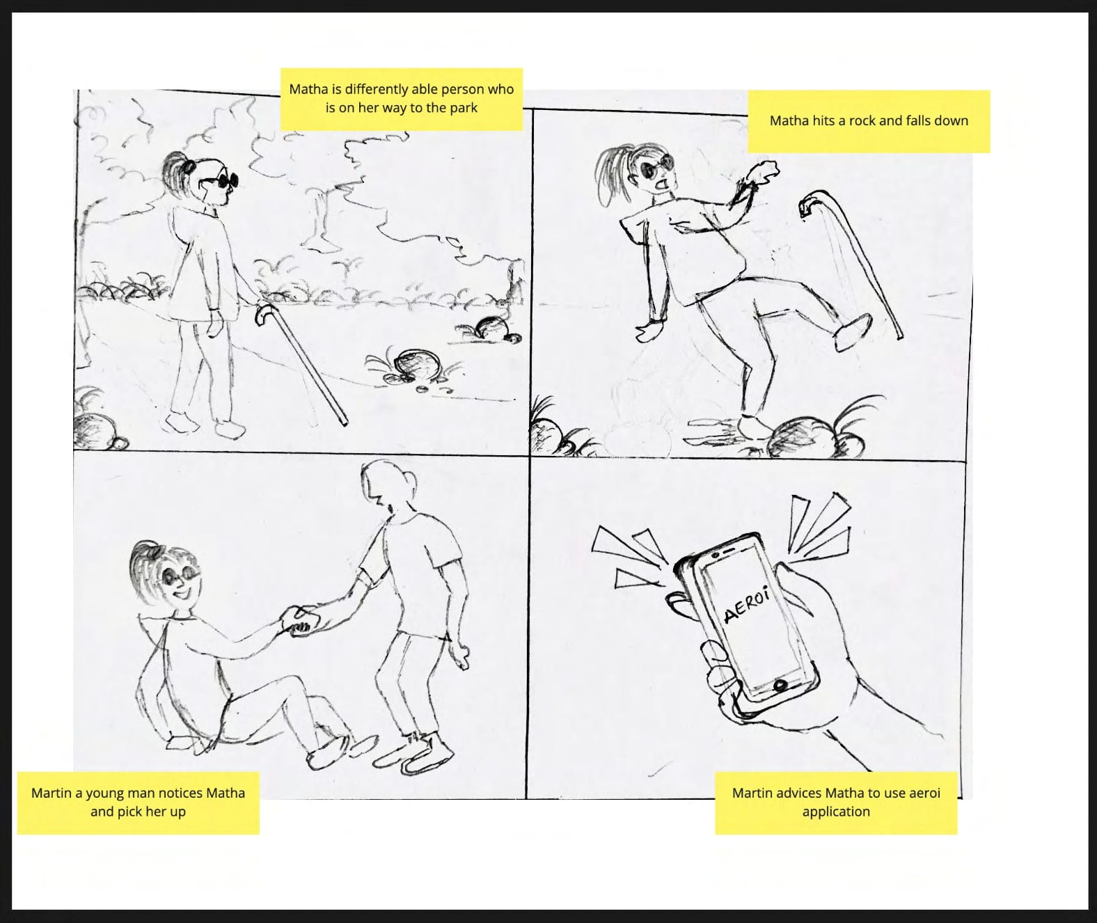
A white cane finds what is directly ahead. It can't say that the obstacle is a chair, that the door is a metre away, or which way to turn. Many blind people end up asking a carer or a passer-by, which costs them independence and privacy.
Recent Pro iPhones include a LiDAR scanner that measures distance to the surfaces in front of it. I wanted to see whether that sensor, with voice and haptics, could give blind people more awareness of their surroundings.
Research
Few people knew of assistive apps, and fewer believed they help
I ran a Google Forms survey aimed at carers and at people who knew someone blind, asking about daily routines, the technology they used, and whether they preferred voice or haptic feedback. It received 39 responses. Only a quarter knew of any assistive apps for blind people, and fewer than four in ten of those who answered thought such apps really help.
From this and from desk research into LiDAR, I wrote a proto-persona: Nethan, a 26-year-old blind law student who hates having to ask strangers or his carer for help and wants more privacy. Because this was a proto-persona built on assumptions rather than interviews with blind people, I treated everything that followed as hypotheses to test.
Framing
Three hypotheses, and one riskiest assumption
Instead of a single problem statement, I framed the work as Lean UX hypotheses. 1. LiDAR and AI can give Nethan accurate information about his surroundings, so he comes back to the app. 2. GPS, the accelerometer and the gyroscope can give support workers the location and health data they need to care for someone. 3. A wearable device with AI text-to-speech gives immediate feedback and, in effect, a new sense.
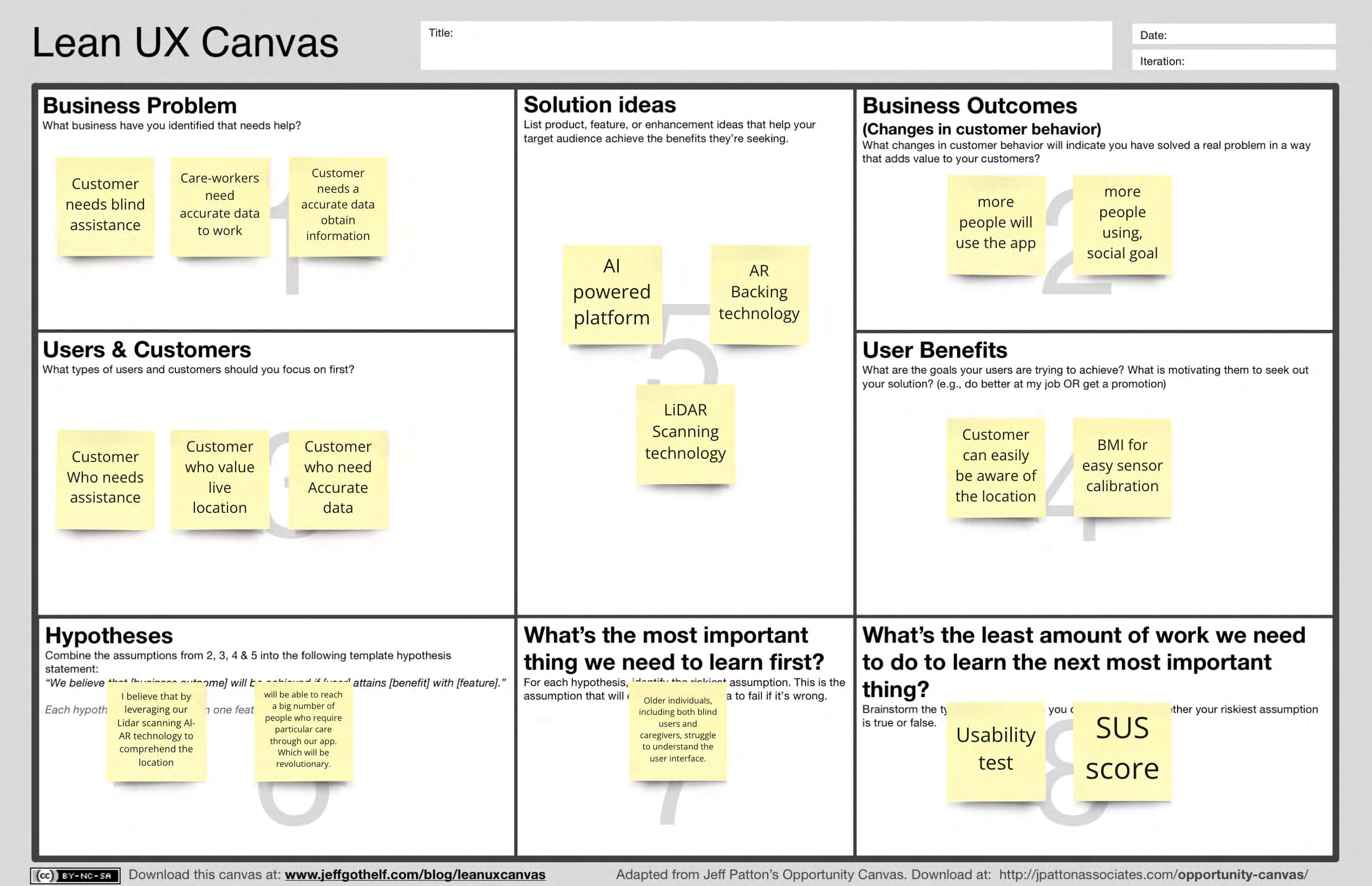
The canvas identified the riskiest assumption: older people, whether blind users or carers, would struggle to understand the interface. That shaped the decisions below.
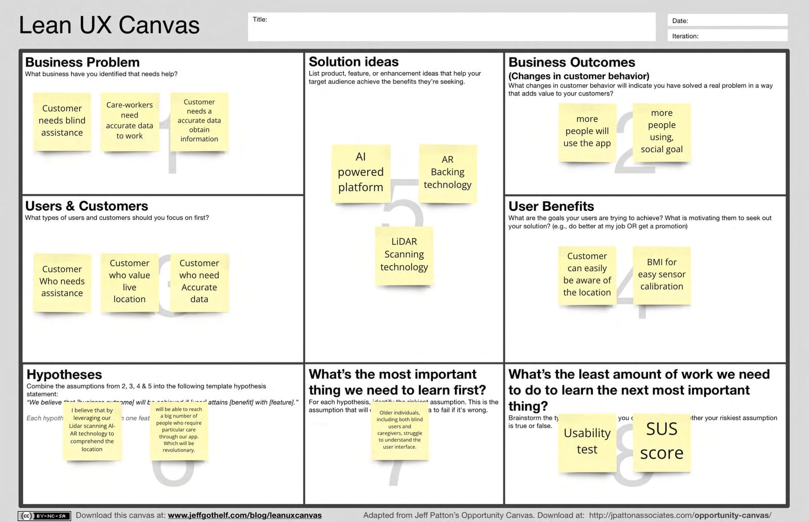
The canvas made the riskiest assumption explicit (older users and carers might find the interface hard) and named the cheapest way to learn: a usability test with a SUS score.
View full mapWhat the map shows
- Users: people who need assistance, people who value live location, people who need accurate data.
- Solution ideas: an AI-powered platform, AR, and LiDAR scanning.
- User benefits: knowing where they are, and simple sensor calibration based on body measurements.
- Riskiest assumption: older people, both blind users and caregivers, struggle to understand the interface.
- Smallest test: a usability test and a SUS score.
Decision 1
Voice and vibration lead, and the screen only backs them up
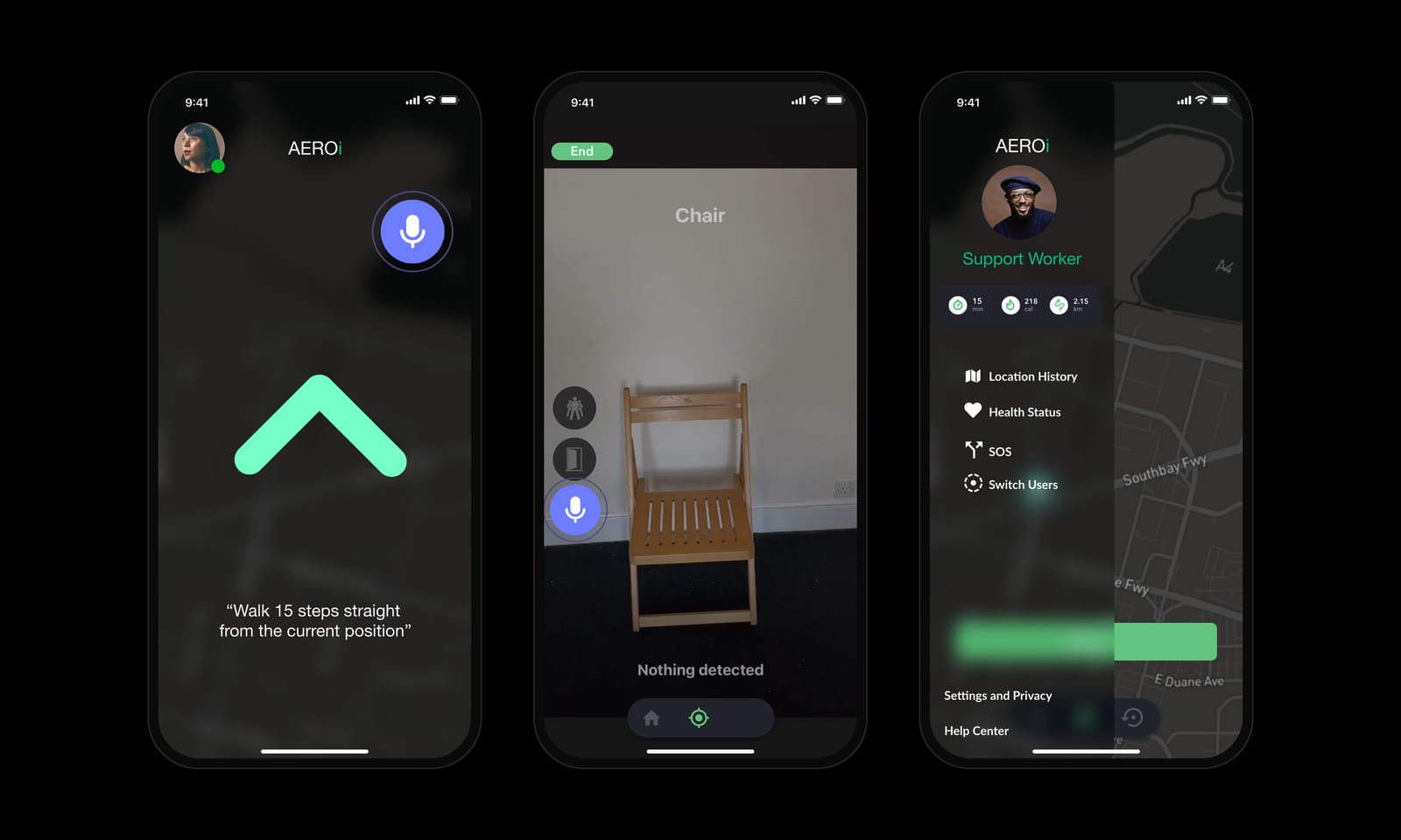
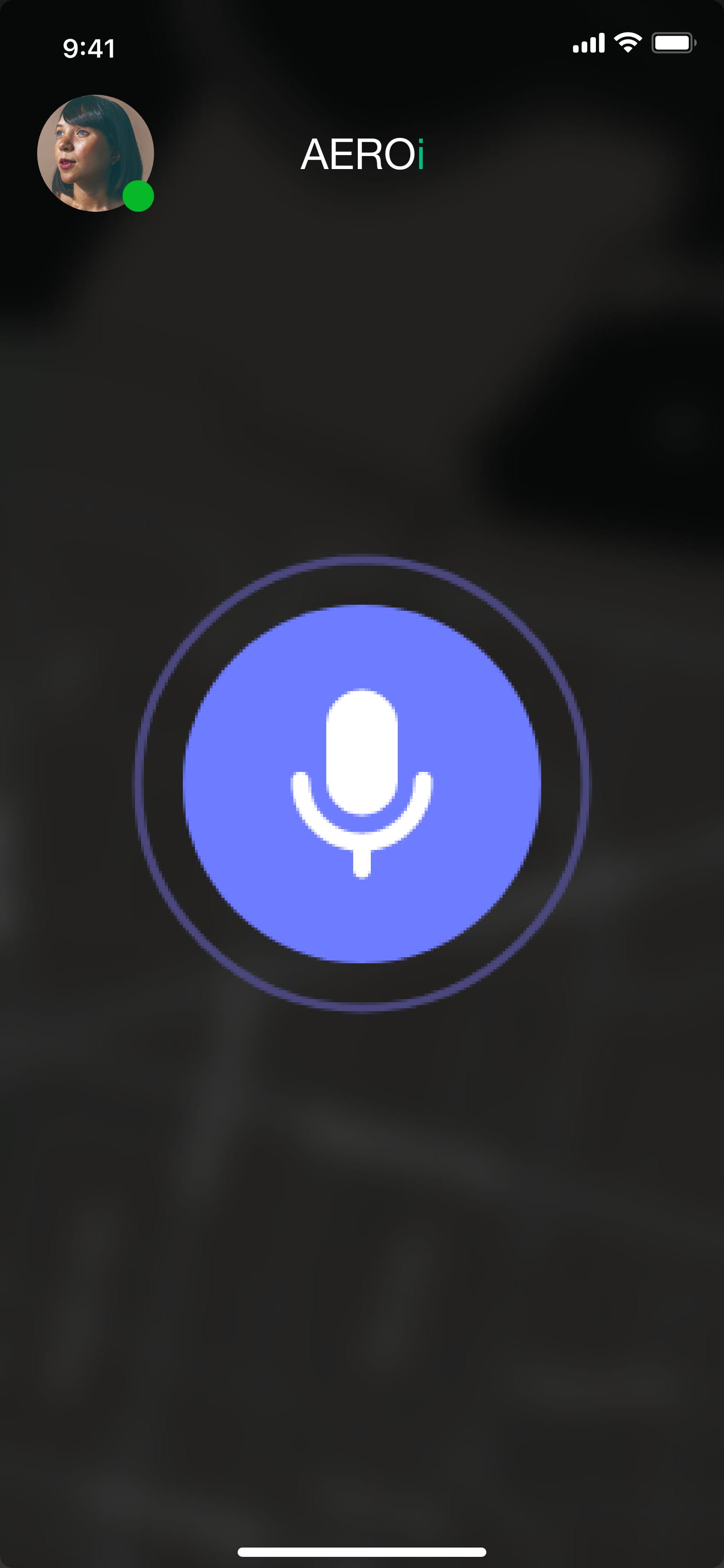
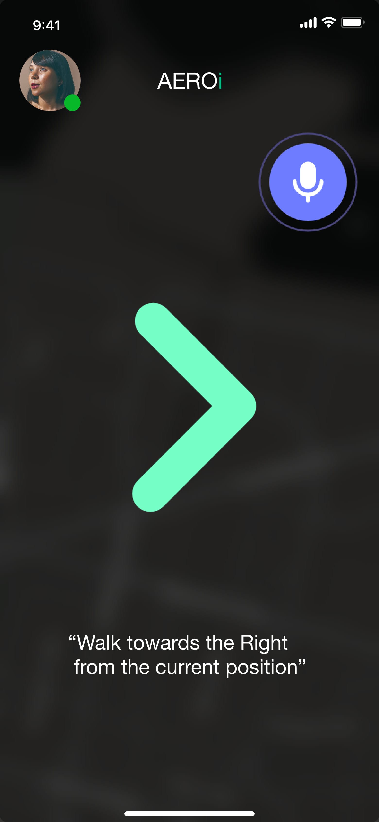
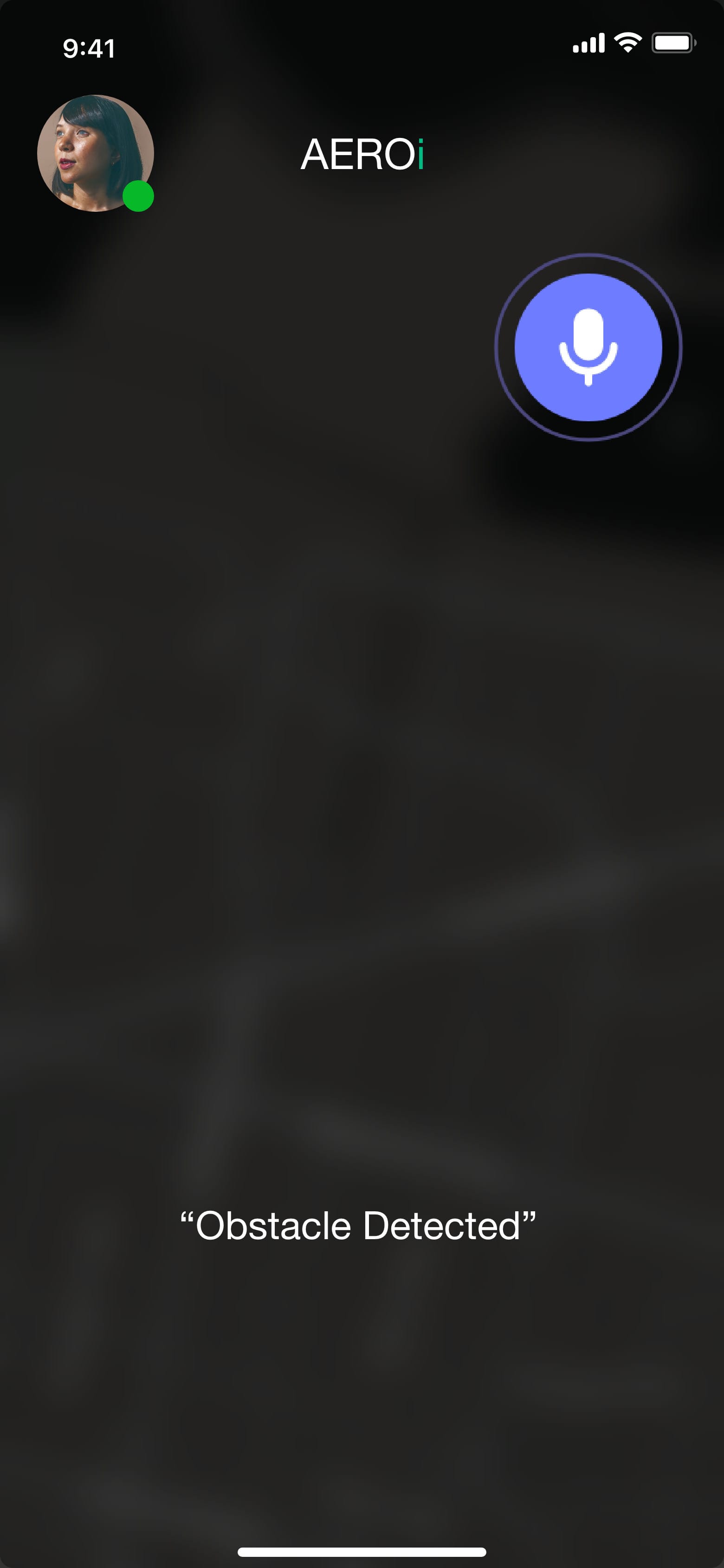
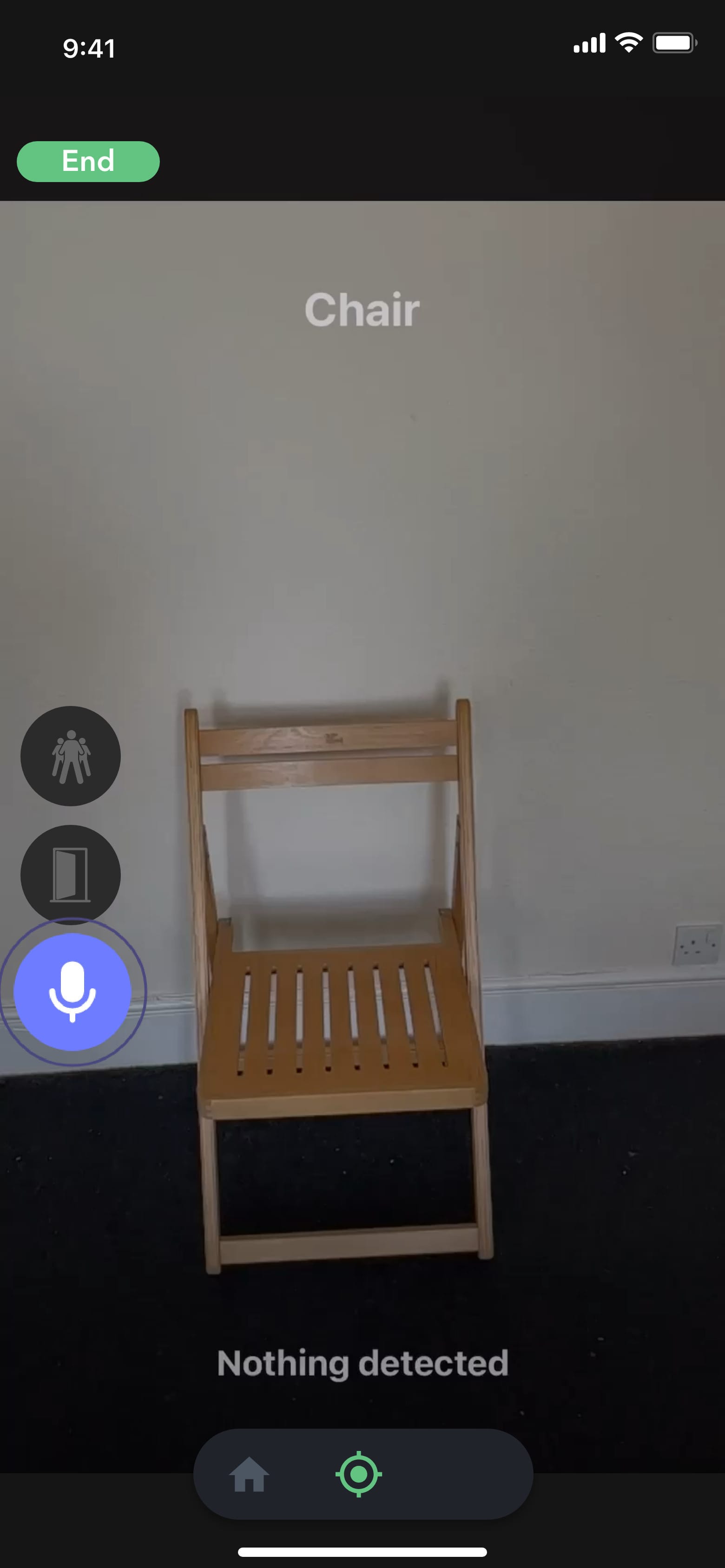
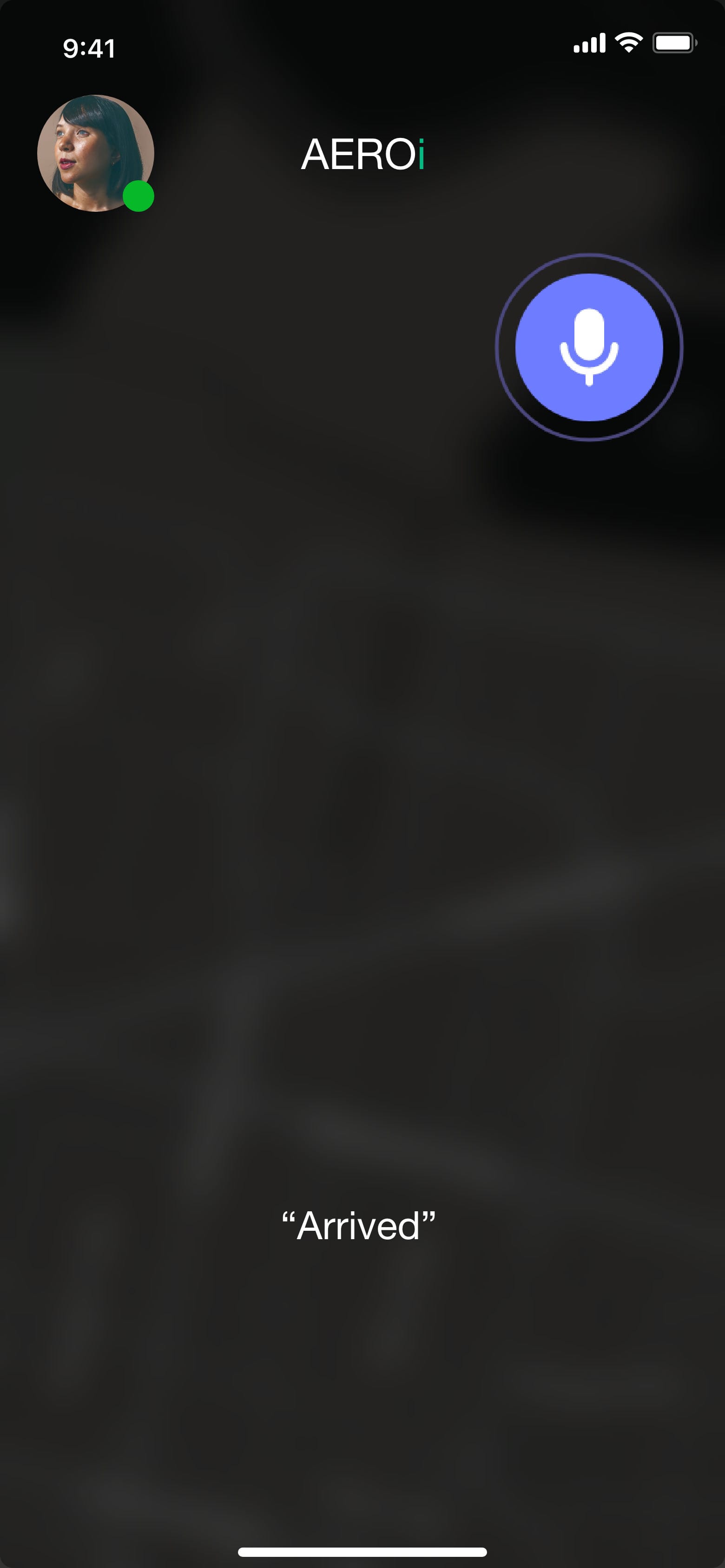
A blind user can't read a busy screen, so every guidance screen carries a single large symbol and one short spoken line, such as 'Walk 15 steps straight from the current position'. Distance is also given as sound: a higher pitch means more space, a low pitch means an obstacle is close, and the phone or glasses vibrate when something is right in front. Object detection names what the camera sees, such as a chair, a door or raw metal.
The large symbols are there for people with some sight and for carers looking on. The trade-off is that audio can fail in a noisy street, which is why haptics give the most urgent warning, not voice alone.
Decision 2
Separate modes for the blind user and the support worker
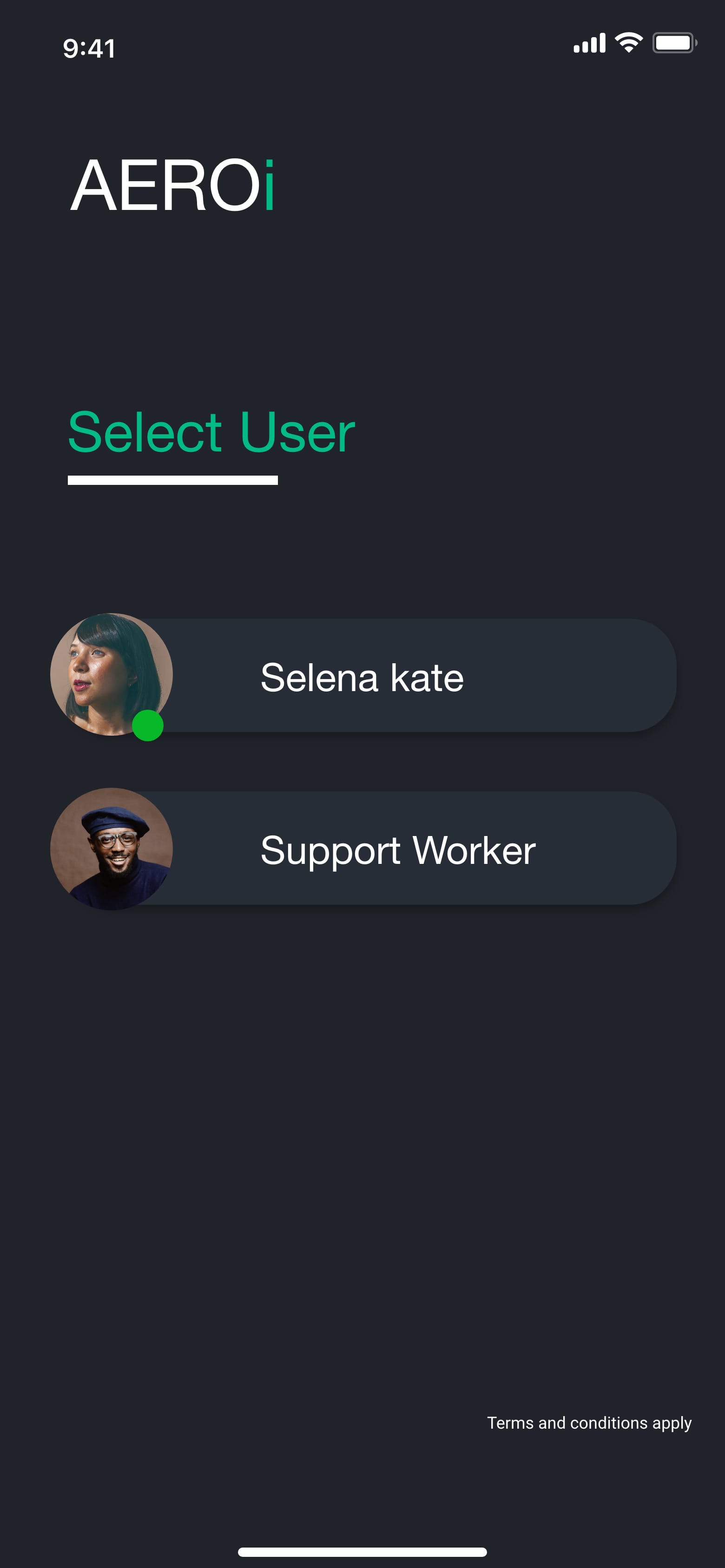
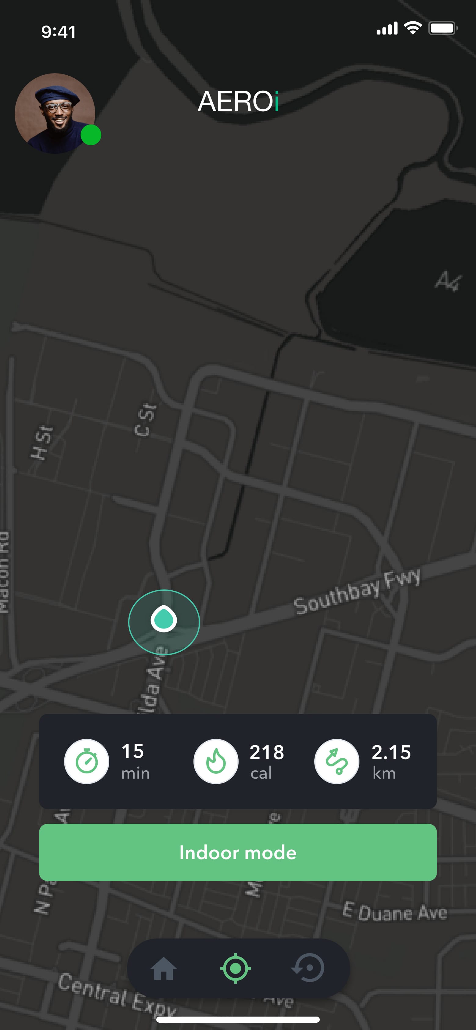
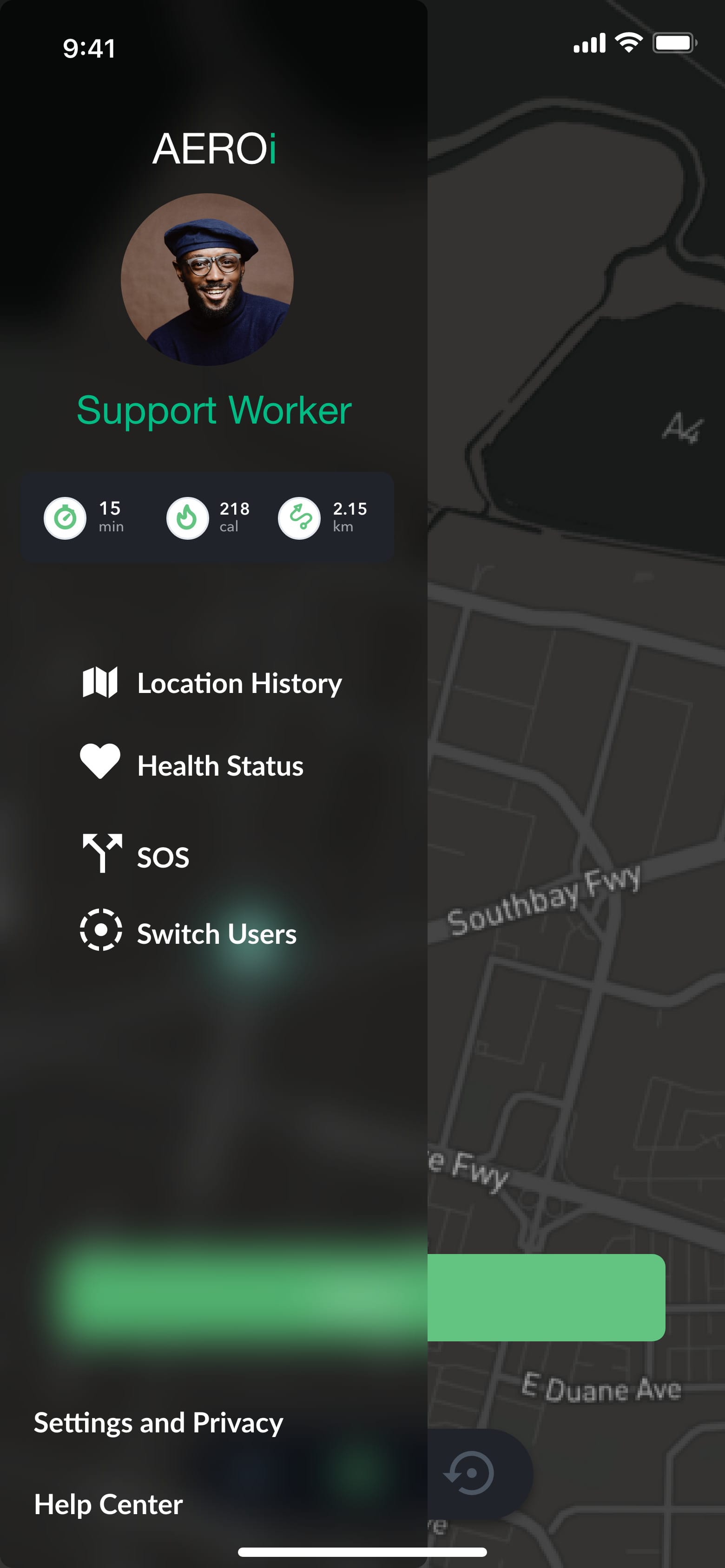
My survey was aimed at carers, and the Lean UX canvas named care workers who need accurate data as a key customer. Instead of a separate app, a support worker chooses their own mode at sign-in. It shows the person's live location, activity, health status and an SOS function, while the blind user's mode stays voice-led and minimal.
This is where the hardest tension in the project sits. Nethan wants more privacy, and a tracking feature takes some away. A real version would need the blind user to control who sees what and when, and it would need consent built in from the start. My prototype doesn't solve that yet.
Decision 3
Phone first, with glasses as the hands-free version
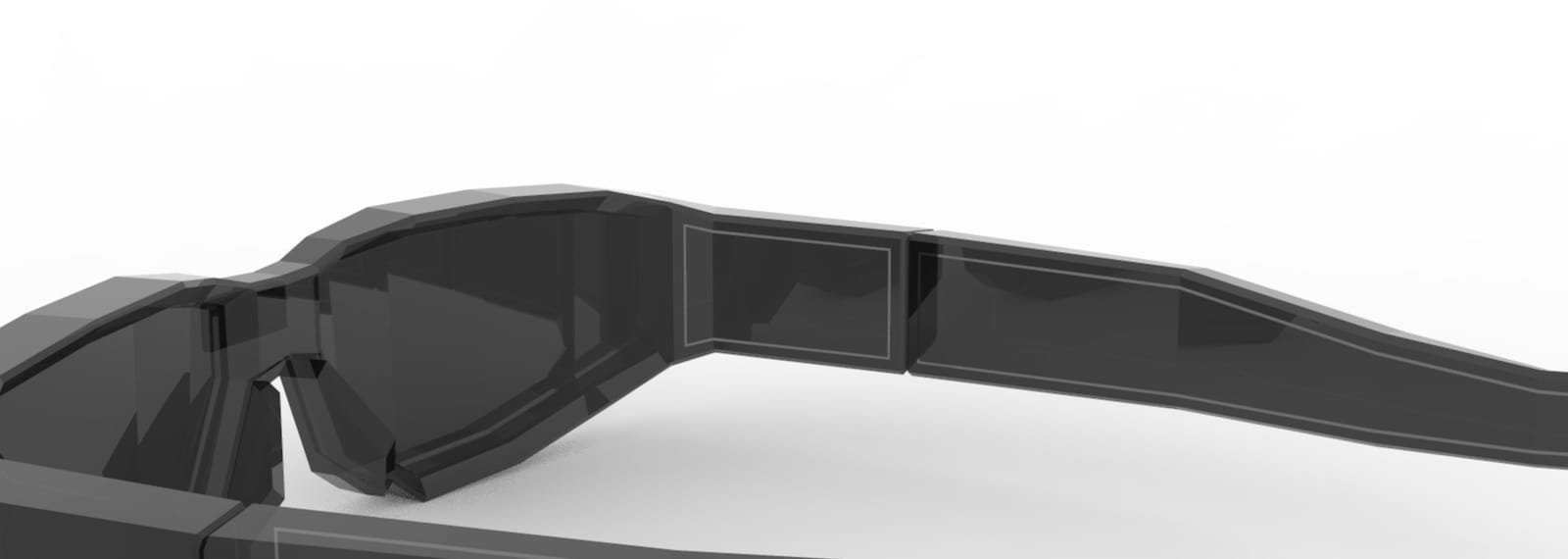
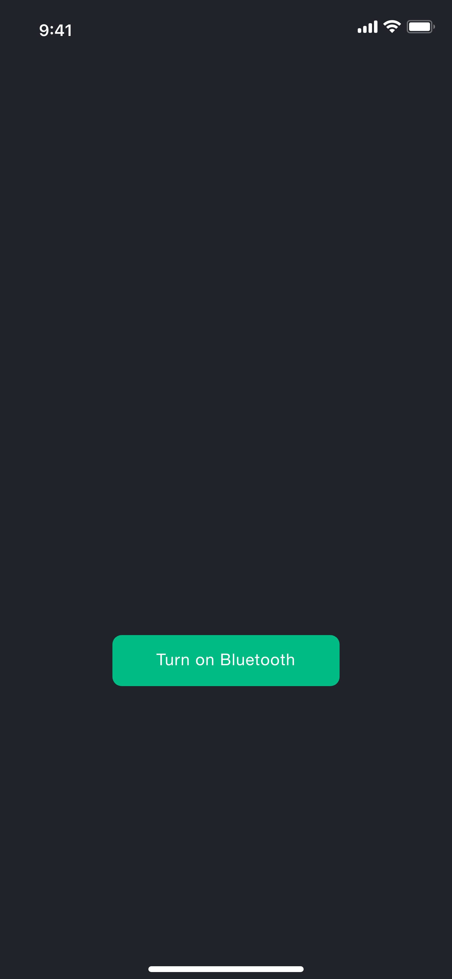
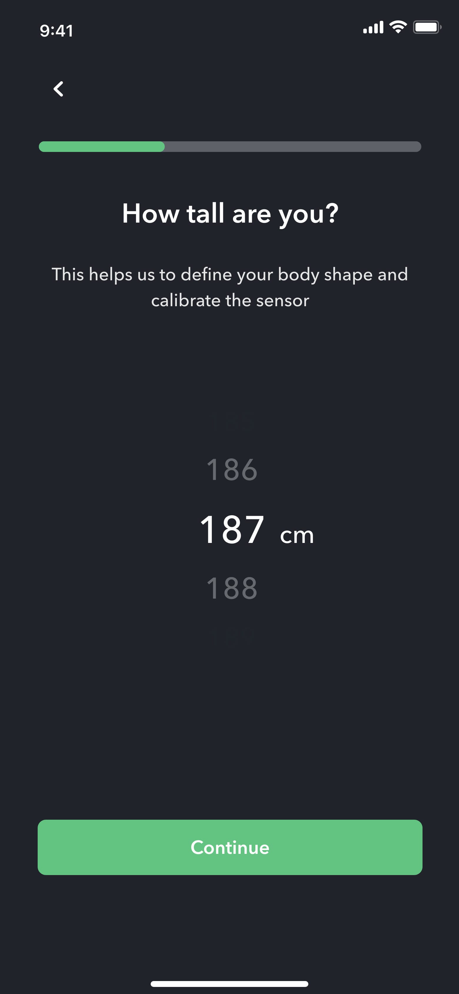
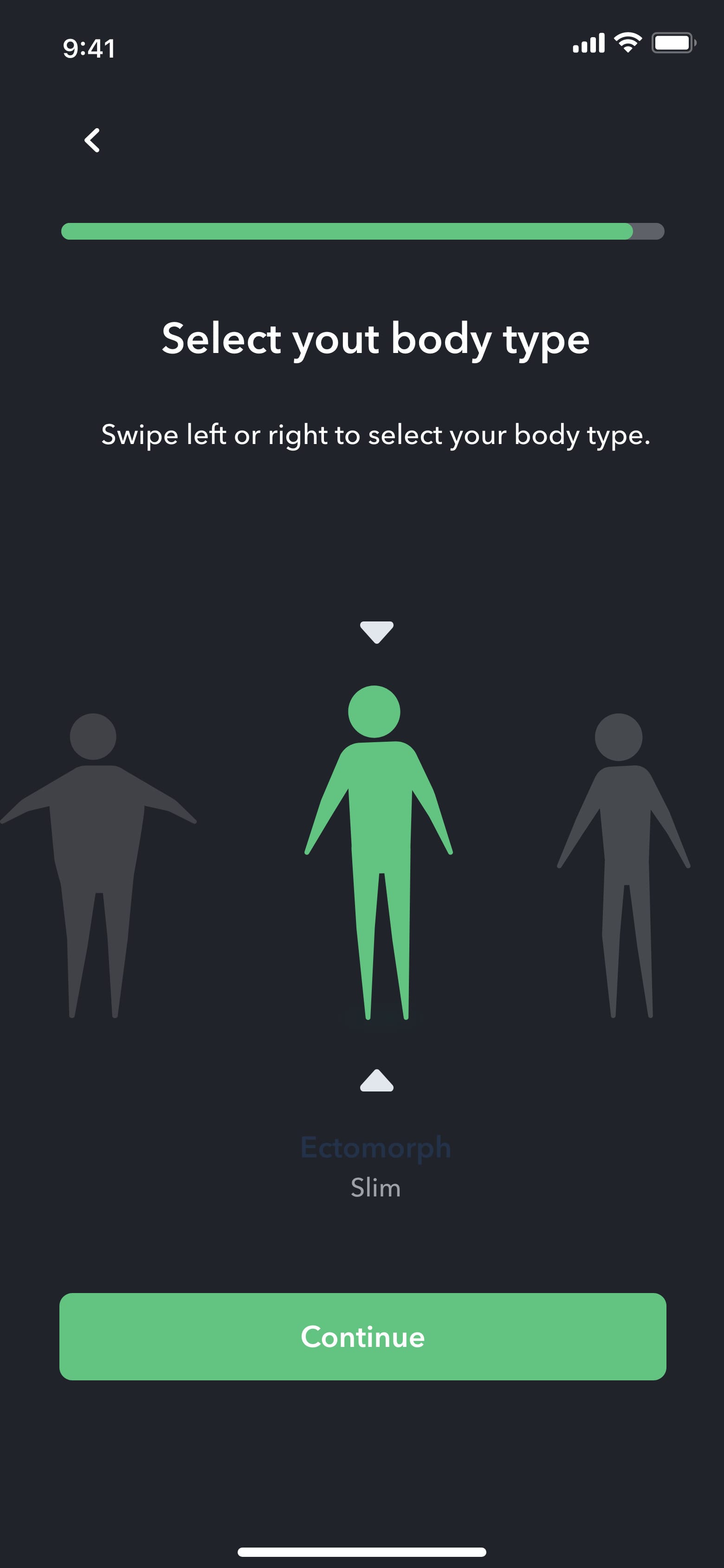
LiDAR already exists on the iPhone 12 Pro and later, so the app works on a phone with no new hardware. But a blind person walking often has a cane in one hand, so holding a phone up is awkward. I modelled a concept pair of glasses with a LiDAR sensor at the bridge and a haptic motor and speaker in the arm. They connect over Bluetooth, and a short calibration (height, weight and body type) tunes the sensor to the wearer.
The glasses are speculative. I haven't validated their range, battery life, cost or comfort. Indoor mode lets people use the phone at home without wearing them.
Solution
The prototype: speak a destination, follow the cues, hear what's around you
I built the hi-fi prototype in Adobe XD with a dark interface, high-contrast green and violet, and recorded text-to-speech prompts. The cut below shows setup, user selection, step-by-step guidance, the support worker's map and object detection.
Validation
A small test showed the flows were clear to sighted users, so blind users are the next test
Two sighted participants used the clickable prototype on screen to complete three tasks. They gave System Usability Scale scores of 85 and 72.5 (mean 78.75). They also rated how far they agreed with each of my three hypotheses, from 80% to 100%. With two sighted people, this only shows that the flows made sense to them.
What I'd do next: recruit blind and low-vision participants through a charity such as the RNIB, test with VoiceOver on a real device, and measure whether they reach a destination without help, how many obstacles they miss, and how many times they have to ask someone. I'd also run a separate study on whether users trust the tracking in support worker mode.
- sighted participants, clickable prototype
- 2
- mean SUS score (85 and 72.5)
- 78.75
- blind or low-vision participants so far
- 0
| P1 | P2 | Total | Agreement | |
|---|---|---|---|---|
| Hypothesis 1: LiDAR and AI describe the surroundings | 10 | 10 | 20 | 100% |
| Hypothesis 2: location and health data for support workers | 10 | 6 | 16 | 80% |
| Hypothesis 3: glasses with text-to-speech | 10 | 8 | 18 | 90% |
Both participants backed the core idea. The support worker mode had the weakest support, at 80%.
Each participant scored each statement out of 10; overall agreement 90%. Two sighted participants. Source: my AEROi presentation, 'Hypothesis Success' slide.
Reflection
What I'd do differently
I designed for blind people without speaking to any, and that is the biggest gap. Next time I'd start with interviews and co-design sessions with blind and low-vision people, before choosing any technology. I'd also design the voice interaction first, with the visual interface derived from it, and I'd keep the support worker's data off by default.
Research data
Full research data
The survey and test numbers behind this concept (2022). The samples are small, and both test participants were sighted.
Survey: 39 respondents2 charts
Usability test: two sighted participants, three tasks2 tables
| Task 1 | Task 2 | Task 3 | |
|---|---|---|---|
| P1 | 145 s | 185 s | 240 s |
| P2 | 149 s | 176 s | 257 s |
Both participants took about the same time on each task, and Task 3 took longest for both.
Clickable Adobe XD prototype on screen. Source: my AEROi presentation, 'Hypothesis Success' slide.
| SUS score | |
|---|---|
| P1 | 85 |
| P2 | 72.5 |
| Mean | 78.75 |
A mean of 78.75 suggests the flows were clear to sighted users. It says nothing yet about blind users.
Total 157.5 across two participants. Source: my AEROi presentation, 'Hypothesis Success' slide.
Want to talk about this project? Get in touch